
Deserve Brand Redesign
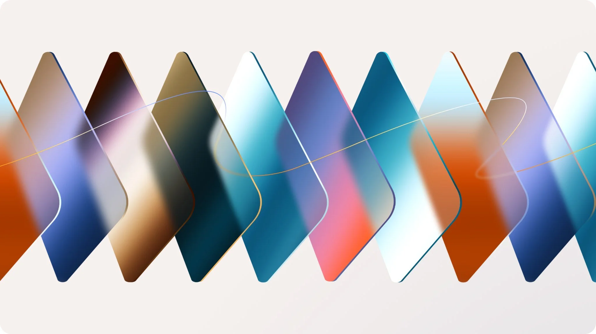
Gradient Stacked Credit Cards
Client
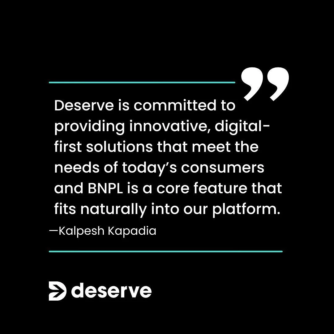
Deserve is a B2B Fintech service. They provide a credit card platform that enables other companies to offer branded credit cards, rewards programs, and customer analytics.
Objective
We conducted a branding overhaul that showcases an innovative and modern design. The goal was to make the fintech and credit card space approachable, unique, and playful. We wanted to strike a balance between professionalism and whimsicalness.
Previous Branding


Deserve’s original branding exuded an aura of starkness, seriousness, and unapproachable elitism that is common in fintech. The use of black and cool-toned teal contributed to that sentiment. We wanted to bring more life and color to the brand and bring a more welcoming look to finance in the tech space.
Competitor Analysis
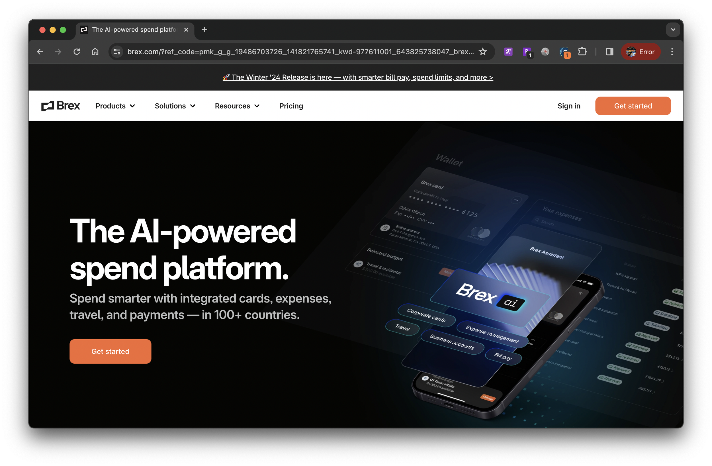
Competitor: Brex
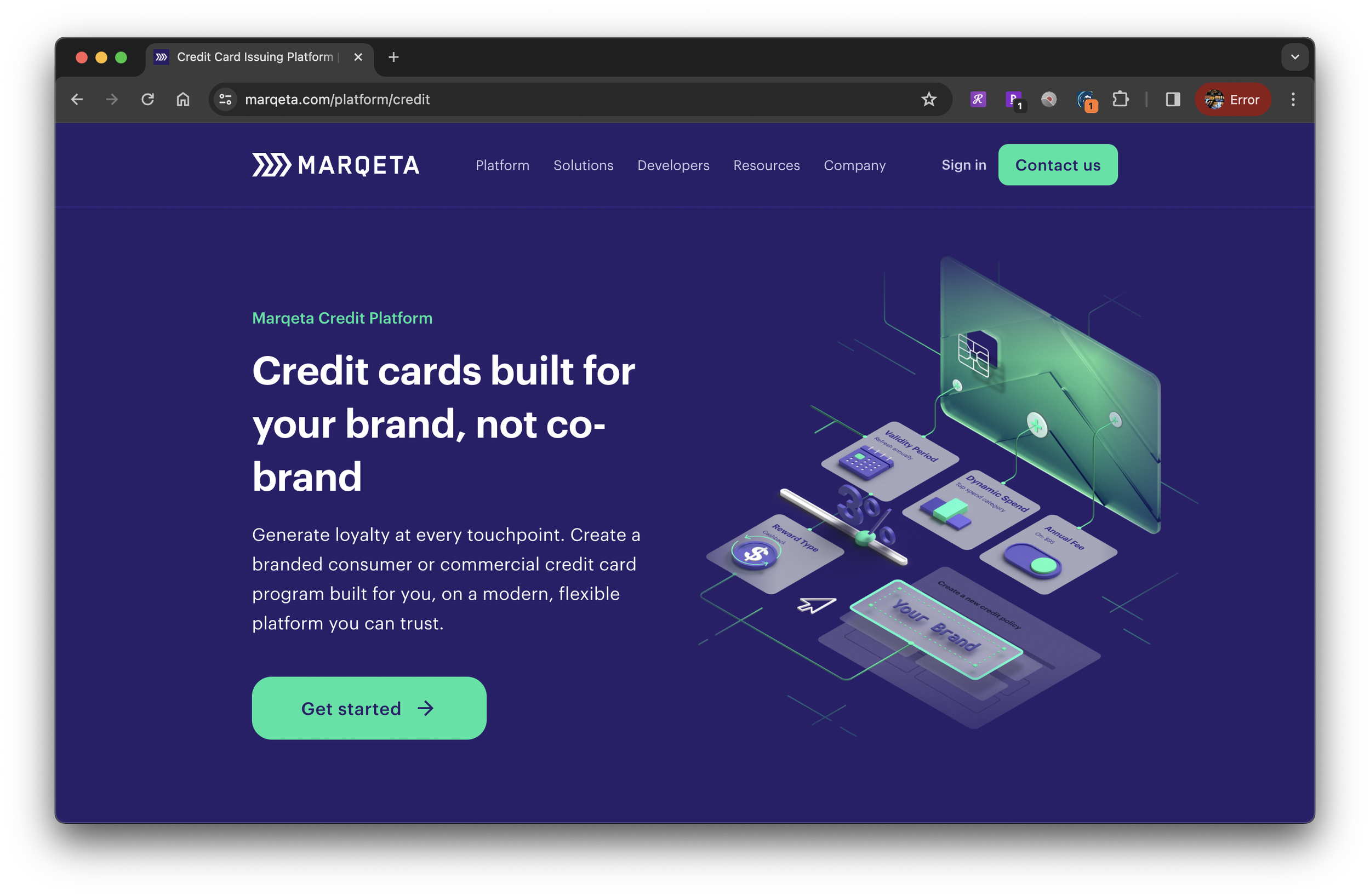
Competitor: Marqueta
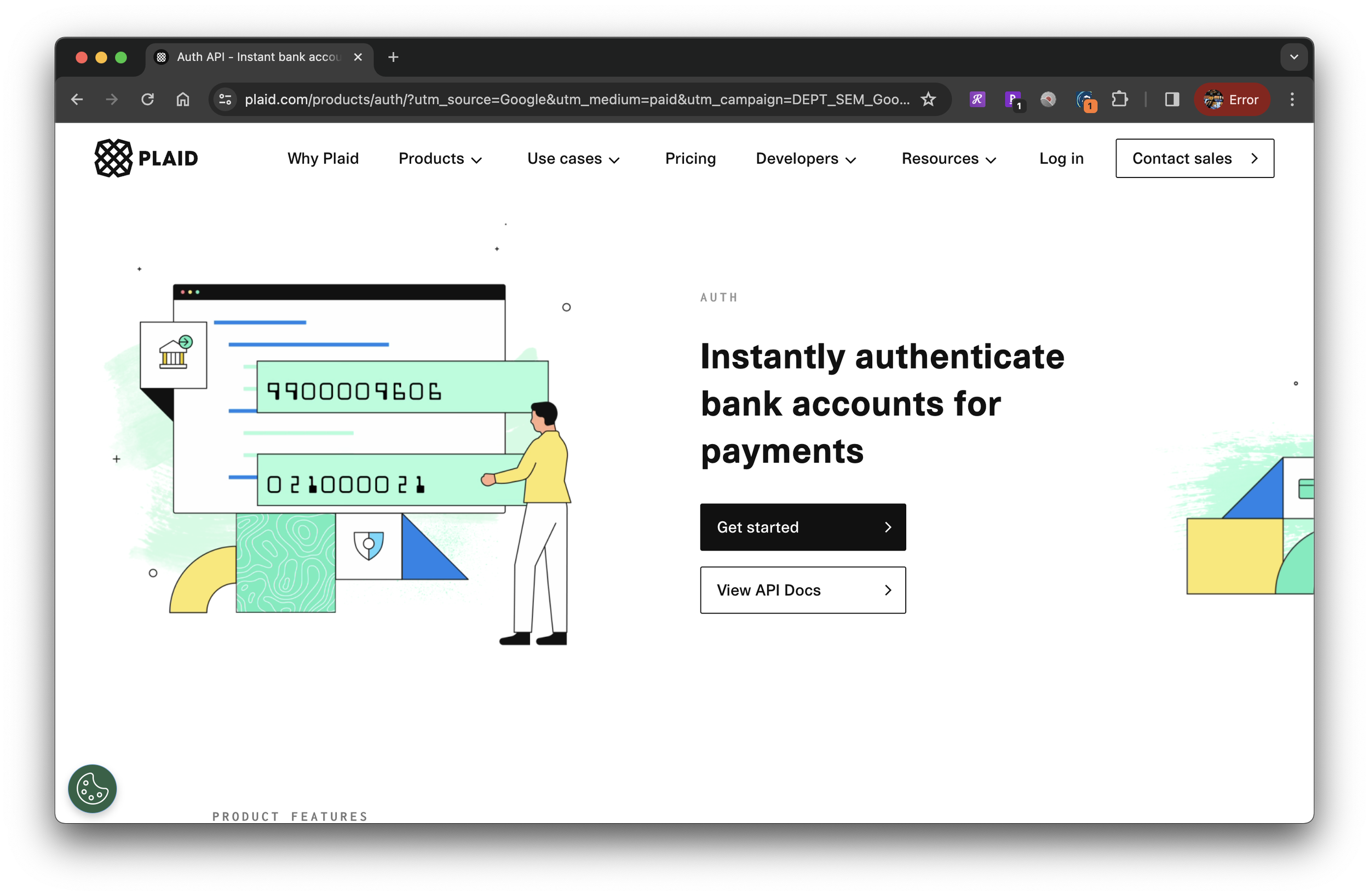
Competitor: Plaid
First, we analyzed our competitors’ designs to see the prevailing patterns common in the fintech space. Brex, Marqeta, and Plaid all use intricate illustrations that heavily focus on showcasing their UI and features. However, at a glance, this made the product seem overwhelming and complicated. The imagery communicated the type of partners they were looking for was tech-savvy and developer-focused. Deserve’s rebrand sought to stand out amongst competitors with graphics that were inviting and easily digestible for viewers from a diverse range of sectors.
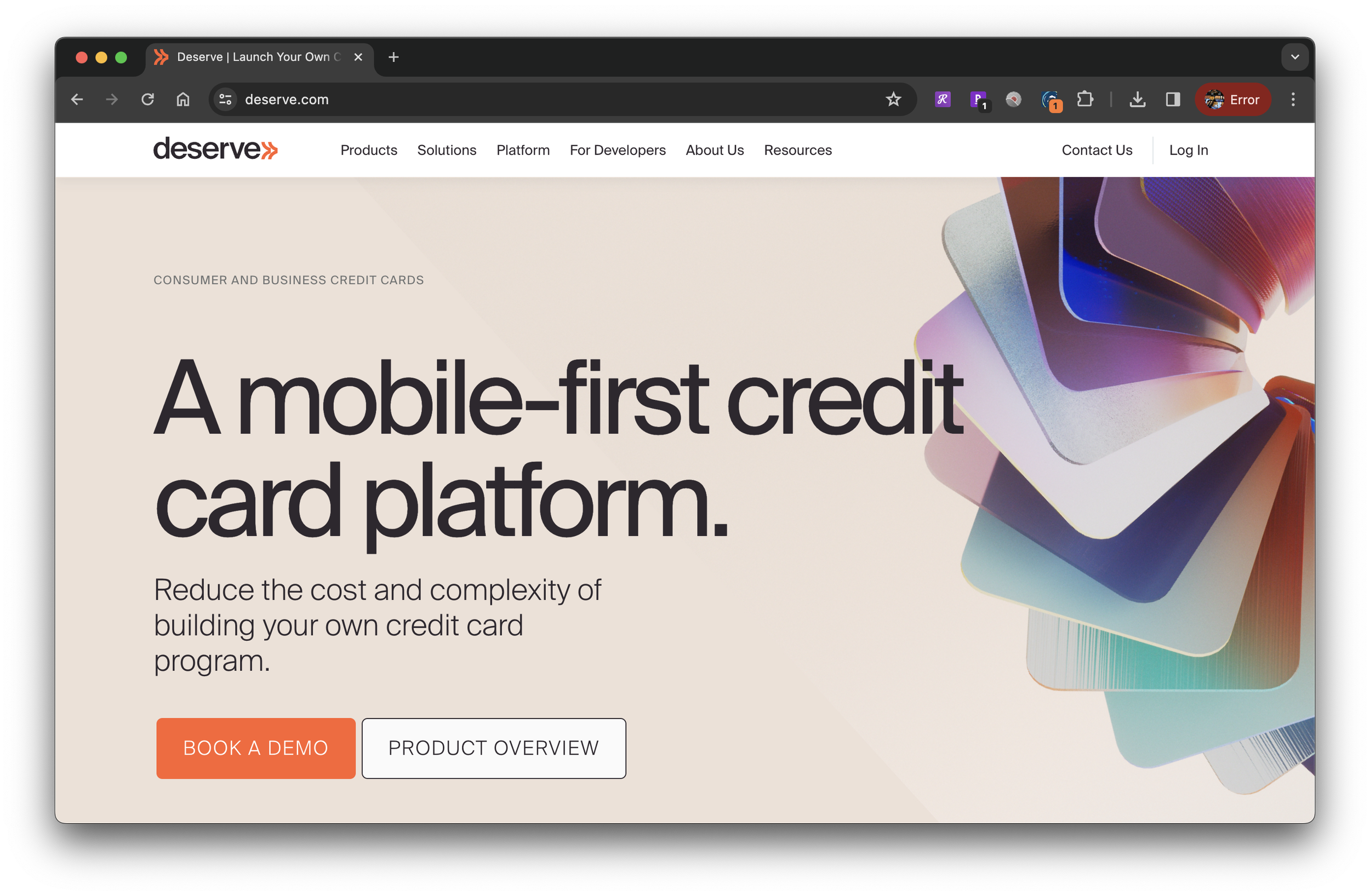
Updated Branding


Deserve’s new branding feels like a ray of sunshine after a long, cold winter. The warm tones invite the viewer to relax and explore the product offerings with ease. It injects some excitement and energy to focus on the creative rewards the end customer could enjoy.
We chose orange as our bold and energizing primary color while adding an expanded color array to our secondary palette. The variety gives us options to create color code systems while maintaining a cohesive palette.
We kept the arrow theme in the logo to pay homage to our roots and to signify forward-thinking, while the curved lines add an air of playfulness.
The imagery we selected pushed the boundaries of previous ideas around finance, technology, and credit cards. Instead of showing literal credit cards, we explored patterns, textures, gradients, and translucency. The result was beautiful, symbolic art that captured the mission of our company: to make fintech innovative and approachable.
Rebranding In the Wild
Deserve Website
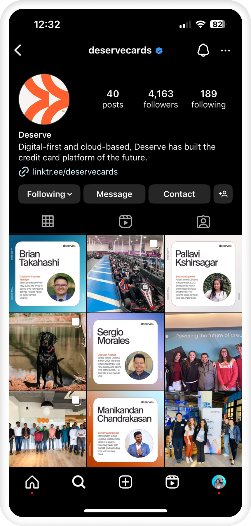
Deserve Instagram
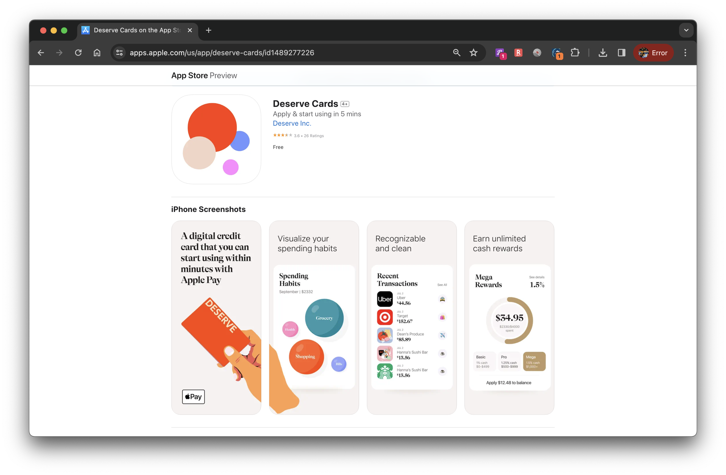
Deserve App Store Screenshots
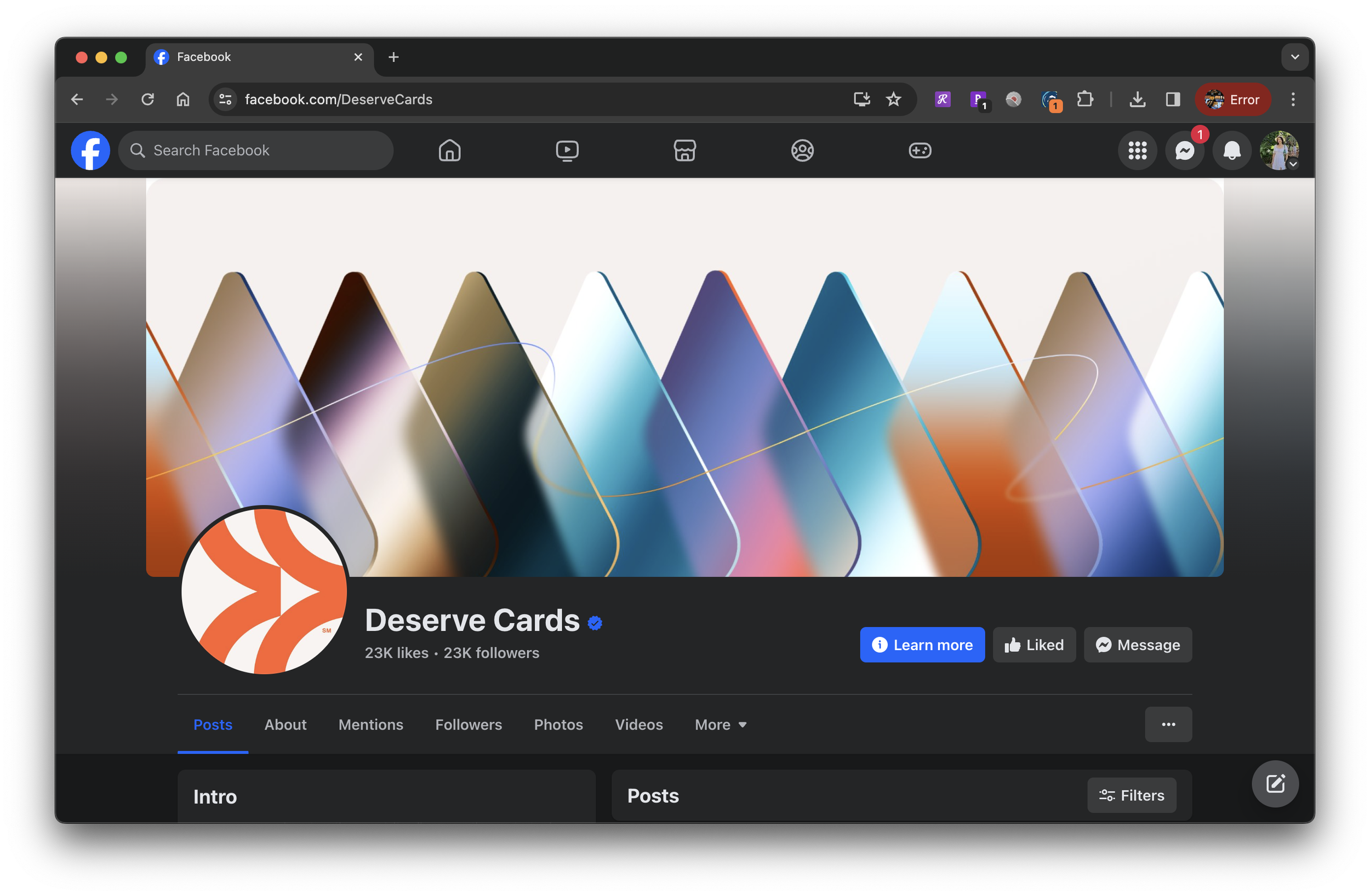
Deserve Facebook Page
Rebranding in Print
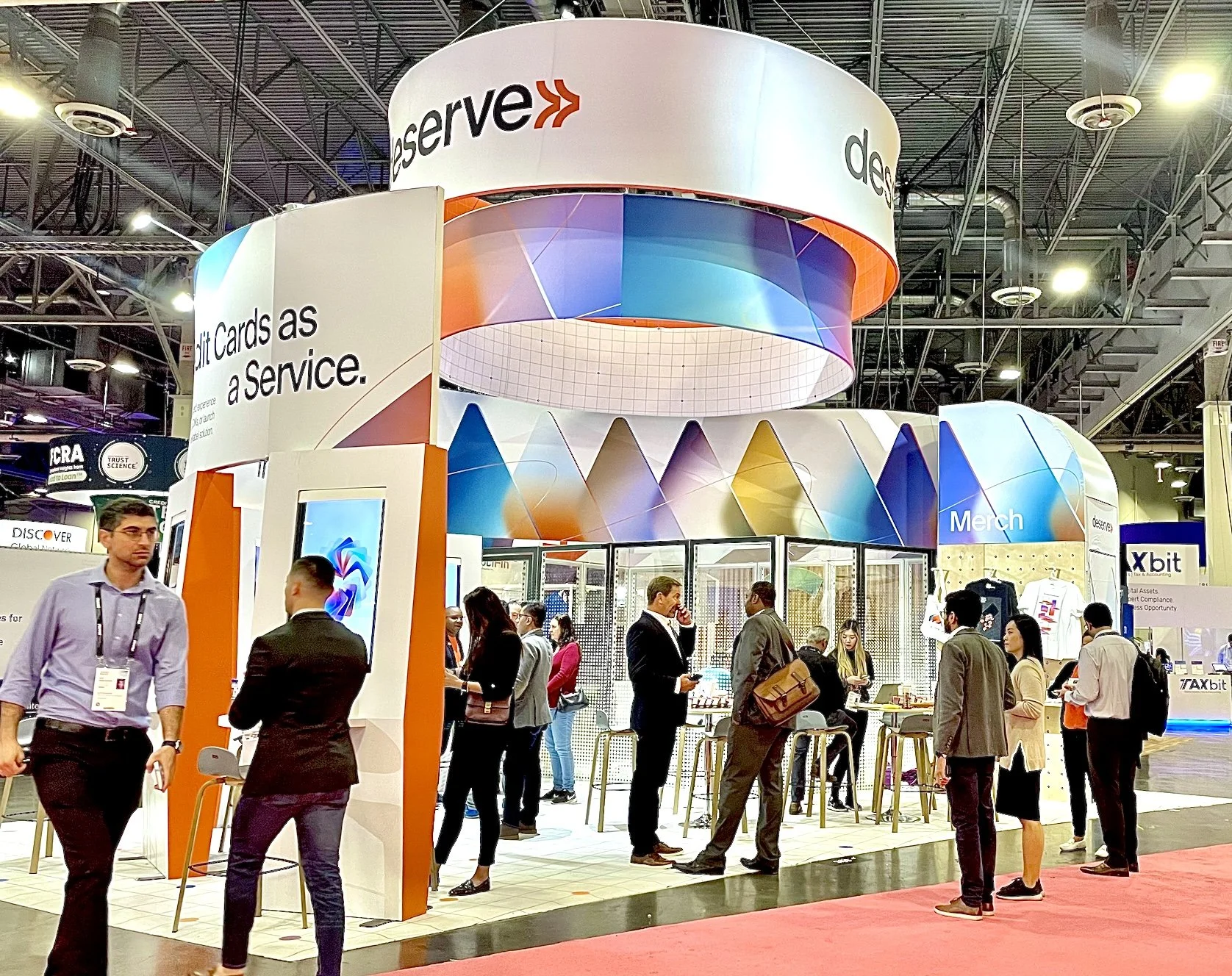
Money 20/20 Conference Booth
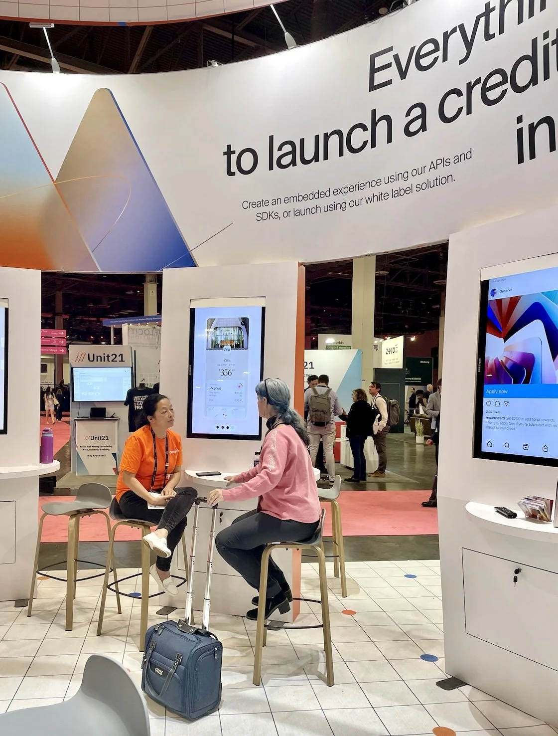
Inside View of the Booth
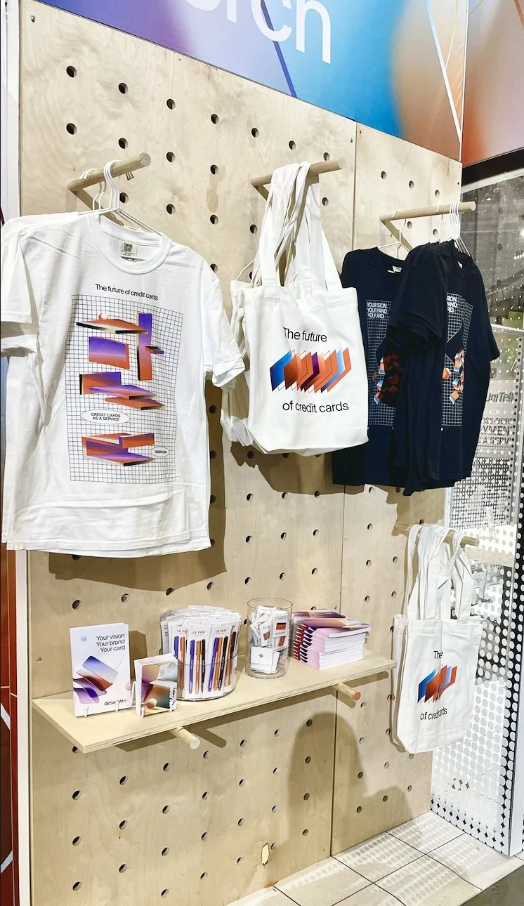
Swag for Confrence Attendees